Funding Circle Investor Portal
Funding Circle is the leading peer-to-peer small business lending platform in western markets, headquartered in the UK. I joined as the sole designer in the US office, reporting to the Head of Design. In two years, I've become the lead designer on investor products owning both the US and UK investor portals.
One big initiative was to completely revamp the investor portal with new brand styles, new features, and redesigns of existing features.

Background
The investor portal is where our investors log in to view and manage their account. It hadn't really been touched since it was built (2-3 years prior to me joining), and the design and features were outdated.
As investors became more familiar with our unique investment product, their behavior and needs became more defined. With the feedback collected over time from the support team and from the investor interviews I conducted, we brought the investor portal up to date with more useful features and rebranded the site with the new style that was rolled out in 2017.
The Problem
Ultimately, investors wanted to know how their portfolio was performing and take action on their investments, but weren't able to with the existing portal.
The existing dashboard wasn't presenting the key performance data they cared most about. A lot of the information also wasn't presented in context, and some data they wanted to see we just didn't provide. There were sought-after features like filtering, sorting, and auto-deposit that weren't available to them.
There were two types of investors - passive ones who only cared to see high level stats every few months vs. active ones who frequently logged in and wanted to dig deeper into details. Regardless of which type, the existing portal was not serving either of their needs, and both wanted information that will enable them to take action on their portfolio as needed.
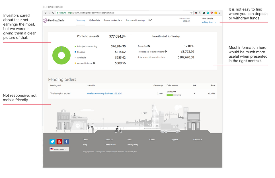
Screenshot of the existing dashboard that was designed by a design agency in 2014.
Design Decisions
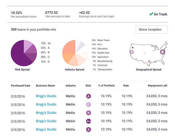
Revamp the dashboard
Screen capture of what was launched in 2018 - designed by Ashley Shen
-
Present key numbers investors wanted to see most at a high level
-
Allow those who want to dig deeper to view a breakdown of the numbers
-
Present data in context to give them meaning
-
Link to relevant pages where they can view even more details and take further action
-
Allow filtering by timeframe
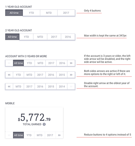
Example of annotations for timeframe filter
Add filtering and sorting on Portfolio page
Screen capture of what was launched in 2018 - designed by Ashley Shen
-
From the dashboard, investors have a direct link to view the details of their current portfolio
-
Investors wanted to be able to view late and default stats but more importantly, they wanted to be able to filter and sort loans based on different characteristics so that they can make sell or buy decisions
Make Pending Orders more useful
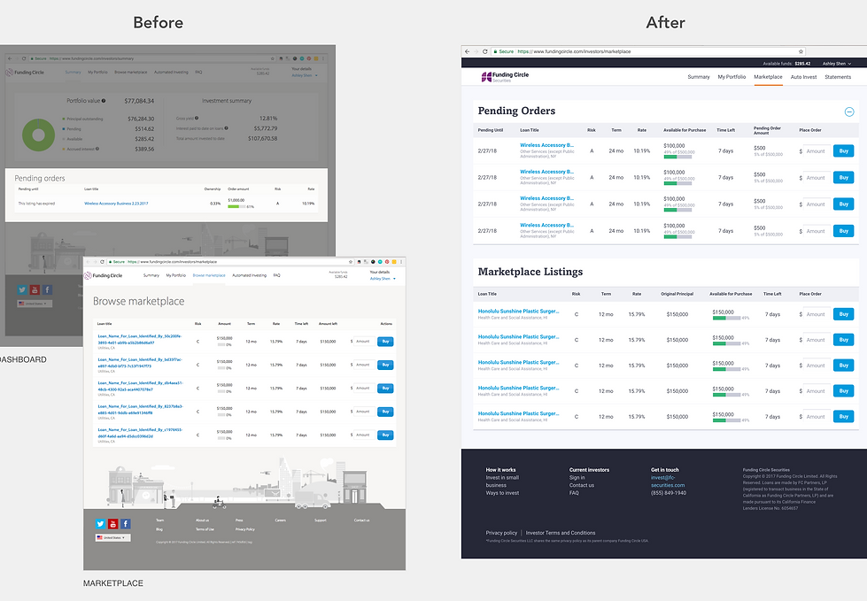
Screenshot of before and after for Pending Orders and Marketplace - new design by Ashley Shen
-
Remove pending orders from dashboard, and make it more useful by moving it to the Marketplace page where it's relevant in context of browsing loans to buy
-
It acts as a filter separating out the ones the investor already placed orders on, and also allows them to easily add to an order if they wished
Redesign transfer flow and offer new auto-deposit feature
Prototype of new transfer flow and recurring transfer feature - prototyped by Ashley Shen using JustInMind
-
Make transfer more accessible by moving it to the main nav as well as adding a shortcut CTA to deposit funds
-
Offer auto-deposit capability so investors don't have to manually log in periodically to deposit funds
-
Add a view for all upcoming transfers that are either pending or scheduled, and allow investors to stop a scheduled transfer if they wish
-
Perceived ease-of-use was very high in usability testing. Average time it took 10 respondents to complete the tasks of depositing and withdrawing funds were each around 1 minute, and around 1 minute 26 seconds for setting up an auto-deposit
Results
25% increase in engagement time on Summary page, and average page views went up 60% after launch.
Ideas for the Future
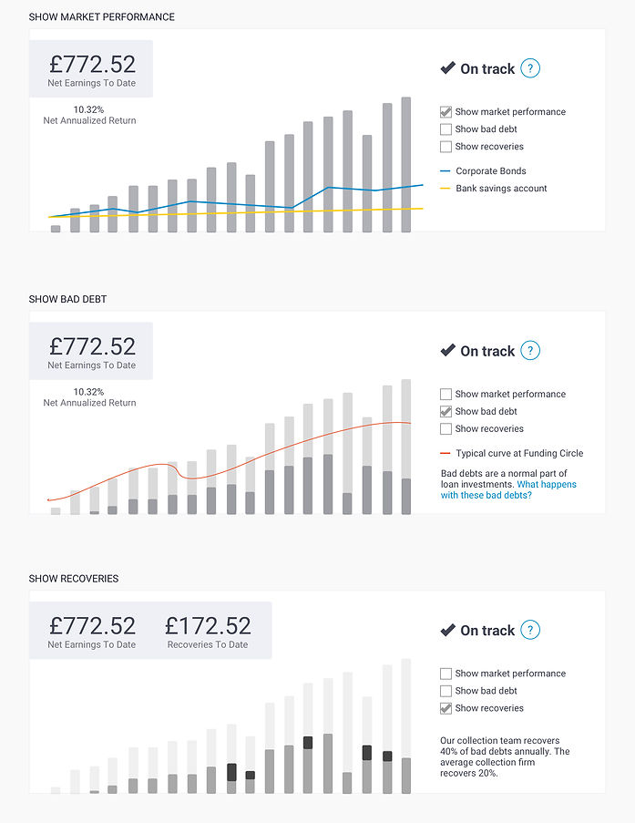
The above dashboard design was for an MVP scope, working with the limited data we have available to show. The following wireframes were a version I proposed as a long term goal which would address some key insights from user feedback:
-
People like meaningful visualizations of their portfolio performance, namely, a picture of their earnings over time
-
Investors were comparing us to the wrong investment products. When an investor had unrealistic expectations with their portfolio performance, they would be disappointed. Reinforcing a comparison to more long-term investment options such as bonds and saving accounts helps them understand how we fit into their overall investment strategy
-
Investors were not educated about the natural curve of loan investment. They were most concerned with bad debts so they definitely wanted visibility into this data. What they didn't know was it is normal for some loans to experience late repayment in the early cycle and that in the long run the returns would outperform the temporary losses if they stayed the course
-
Investors were not aware that Funding Circle has a great collections track record. Focusing on the recoveries amount could help ease their focus on bad debt numbers
Some investors also mentioned really liking the positive impact of our business. By investing, they are directly helping small businesses grow
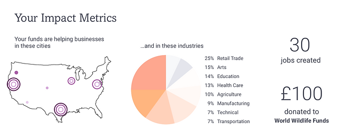
Some also wanted to see a visual breakdown of the loan characteristics that made up their portfolio.
These ideas were presented to senior executives in a long-term vision strategy meeting, and received positive responses from the product team.