The World of Savings at Shipt
Shipt is a same-day grocery delivery service owned by Target. I joined in 2019 as a Senior Product Designer, specifically on the Member Experience team working on our customer-facing app and web products.
In my first year at Shipt, I worked on a series of projects all having to do with helping our customers save money. Being a price-sensitive shopper myself, I loved working on these concepts, thinking through the practical functionalities as well as the emotional aspects of saving money.
All designs shown are new features designed from the ground up by me.


The App Homepage Before and After Adding Savings Page

A rebrand took place while I worked on this project, which is why the left screenshot has a different look and feel from the right mockup.
The Problem
Price sensitivity is especially relevant in grocery shopping. Cost is the biggest reason for churn at Shipt, as grocery delivery services can be seen as too expensive to use.
Shipt did a multi-month user research project focused on grocery shopping and delivery, and one insight revealed that regardless of persona, everybody wants to save money. Groceries are a routine purchase and people want to manage their food spend. In addition, some people take pride in finding a good deal and coming under budget. With grocery delivery, the addition of markups, delivery fees, and tips can make it even harder to stomach.
The Opportunity
Offer more ways to save while also driving down the perception of cost.
After a competitive analysis of big players in the grocery space, it's evident how big of a role sales and promotions play, with some grocers dedicating entire apps to offering savings. There was room for Shipt to expand deal types and an opportunity to consolidate it all in one place so people knew where to go to find them. A centralized Savings page could also help drive down the perception of cost, as could visualizing the customer's savings and the value of their membership.
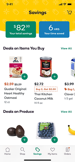
First, Introducing a Savings Page
Goal: To provide a centralized place for customers to find all available offers and deals, and lay it out in a way that is most useful to them.
Testing Two Layouts That Accommodate for Distinct Shopping Behaviors
-
Concept A assumes that people already have an idea of what they want to get; items are laid out categorically.
-
Concept B assumes people like to browse deals for inspiration and impulse buy; items are laid out randomly with an emphasis on the deal.
Concept A
Organized browsing
Concept B
Discount rack style browsing
Prototypes of the 2 concepts that were tested in a UserTesting session - designed by Ashley Shen
Concept A Won Slightly Over Concept B
Both concepts had its pros and cons but 7 out of 12 participants preferred concept A over B for these reasons:
-
Shelves organized by category matched how they shopped and made more sense navigationally
-
It featured a "Deals on Items You Buy" shelf which some people found favorable
-
All product details and add-to-cart buttons were accessible on the page
The bonus was that the shelf components used in concept A already existed so we were able to implement this quickly and start gauging interest as a v1 of Savings page.
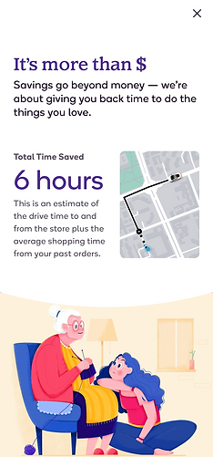
Next, Displaying Lifetime Savings Stats
Goal: To help people feel good about their total lifetime savings at Shipt, not just in money but also time. Also, help convey the value of Shipt and hopefully remind them of what they're paying for.
Integrating Lifetime Savings Stats Into the Savings Page
I explored a range of concepts, from more overt to more subtle, from straightforward stats to creative translations like equating their savings to the number of bananas. After getting feedback from teams, I focused my efforts on the concept named after the candy-coated chewing gum popular in the 90s - Chiclet. It had the most favorable visual balance and prominence without being intrusive to the shopping journey.
Visual explorations of the "Chiclet" concept
(prototype at the end of this section shows what was implemented)


Some other initial explorations
Lend Credibility With Transparency
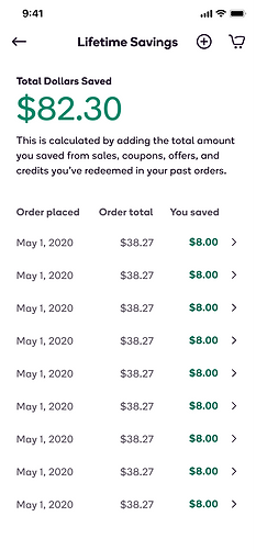
Without any context of what goes into calculating these numbers, it can feel a little gimmicky. I designed the modal to not only provide practical information but to get across what these stats really mean emotionally - the triumphant feeling of saving money as well as saving time on grocery shopping so they can spend it doing what they love. One concept went in an even more practical direction, where people could see a rundown of their past orders and the savings in each order.
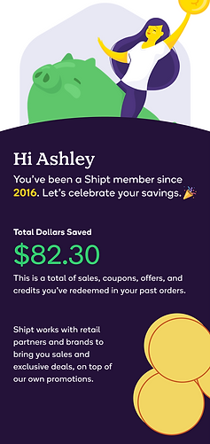
Screen designs by Ashley Shen. Illustrations used as placeholders were found on Dribbble: "Piggy Bank" by Rachel Pardo and "Talking to Grandma" by Felic Art.
Finishing Touches
-
To add some oomph to the stats displayed, I animated the numbers with a roll-up effect. This only occurs when there is a change in the stats.
-
The illustrations had to fit our brand styles so a marketing designer worked with me to create these from scratch.


Animation prototype and screen designs by Ashley Shen. "Girl with Pig," "Gardening," and "Drive Time" illustrations by Nancy Hu.
Adding Digital Coupons
Goal: With the contractual requirements and the complex web of states and flows that come with digital coupons, the goal was to make it as easy to use as possible within constraints so people can take advantage of more ways to save.
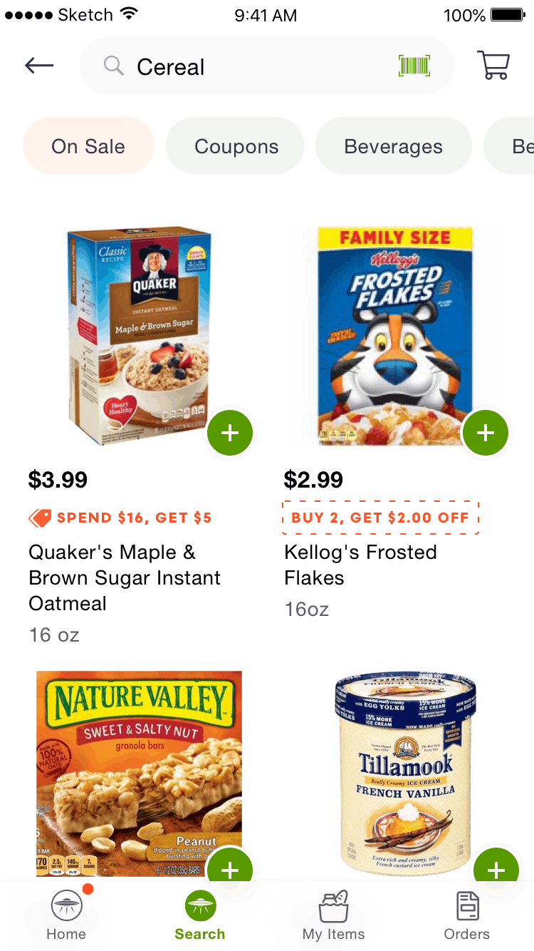
Original Idea
The coupon vendor required an intentional clipping of a coupon in order to redeem it, much like a paper coupon. The original idea was to let people visually see the coupon, clip it, and add the item to their cart all within the space of the product. However, the vendor also required that the full coupon description be visible and the terms are accessible at the point of clipping, which meant this solution wasn't going to work.
I began designing this in the old design system before the rebranded styles were ready, which is why there is a discrepancy with the way this screen looks from others.
Iterated Version
The iterated version satisfied the requirements while keeping it easy to use. With the user's intent in mind, rather than stopping at "coupon clipped," I made sure there was an easy way to fulfill the coupon as well as to browse all items that can be mixed and matched in the deal.
Recording of production app - designed by Ashley Shen
Other Design Decisions to Call Out
-
Coupon needs to be visible and can be clipped from the product detail page
-
Designed for extremes: accommodate for "Buy 1" to "Buy 24" deals
-
Clear visual cues as the coupon changes state from unclipped to clipped to applied
-
Clear progress tracker so people know how far they are from meeting the quantity threshold, and to instill a sense of satisfaction when it is met
-
Piggy bank animation to add a touch of celebratory fun when a coupon has been successfully applied
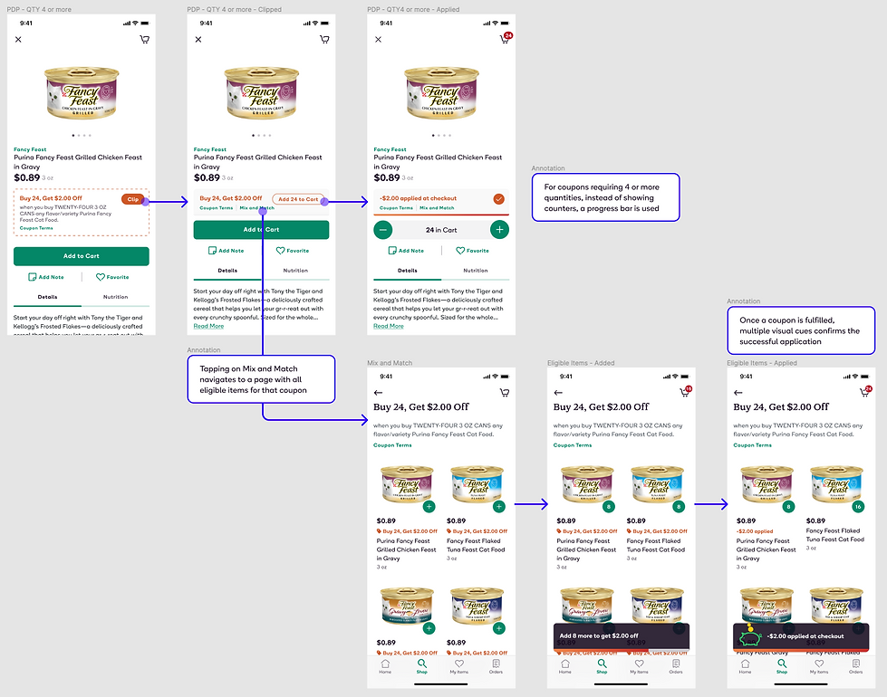
Mock ups and annotations by Ashley Shen
Finally, Surfacing Special Offers
Goal: The purpose of these special promotions was to lower the barrier to trial for inactive or new members with increased savings. This project was about designing how these promos will look in the app and web interface with the right amount of visibility, passive/active reminder, without distracting them or getting in the way of checking out.
Active vs. Passive Reminders

A modal announcement was appropriate for special and infrequent offers, shown the first time the customer logs in.
Offers need to live somewhere as a passive reminder so there's a place to refer to it again, and we chose to show it on the Savings page.

Since the minimum order amount to get the discount can be relatively high, an active reminder as they build their cart tells them if they're getting close. However, we didn't want to get in the way of people shopping so instead of a persistent progress tracker, we pop up a toast only when they are 75% of the way to meeting the threshold.
Different Types of Offers Call for Different Treatments
For offers with a minimum threshold to redeem, it can be risky placing it prominently on the Cart as it can cause cart abandonment if it's hard to achieve. There is also a $35 minimum to get free delivery which is much more attainable so we wanted that to be their primary goal.
On the other hand, a free delivery offer is essentially a free pass to place an order. This requires no effort on the user's part, and should be placed prominently because there is little risk.

Mock ups designed by Ashley Shen. Illustration icon designed by Julia Pak.
Modal Animation Explorations


Spinning Star - prototyped by Ashley
Twinkling Star - prototyped by Ashley. *This is the one we implemented*
Breathing Star - prototyped by Ashley, inspired by Dominic Camozzi
All Combined - prototyped by Ashley
The full range of explorations for these projects aren't shown here. If you're interested in seeing more, please ask.
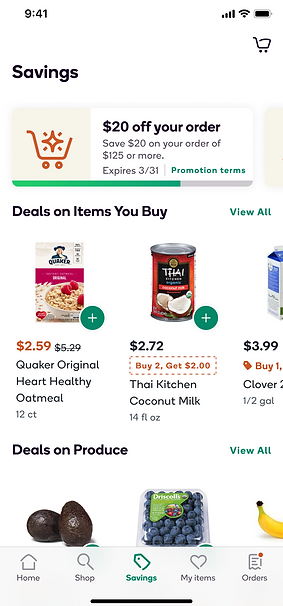
Results & Iterations
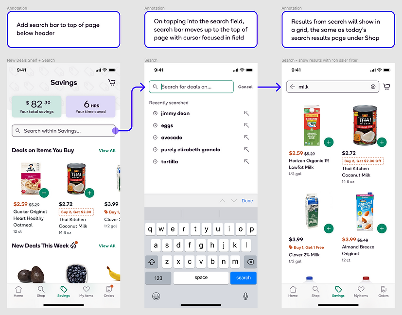
Added search capability on mobile app and a New Deals shelf
We saw people visiting the Savings page but the returning engagement rate was not very high. After doing some user research to find out how this page could be more useful, we found that almost everyone wanted the ability to search or have some way to filter so they can find things easier.
Another hypothesis we had was that there was no signal for new deals becoming available since the last time they visited the page. To test this, we added a "New Deals This Week" shelf to drive newness and freshness.
Two months after these rolled out, the percentage of items added to cart from the Savings page by active users went from about 10% to 30%.
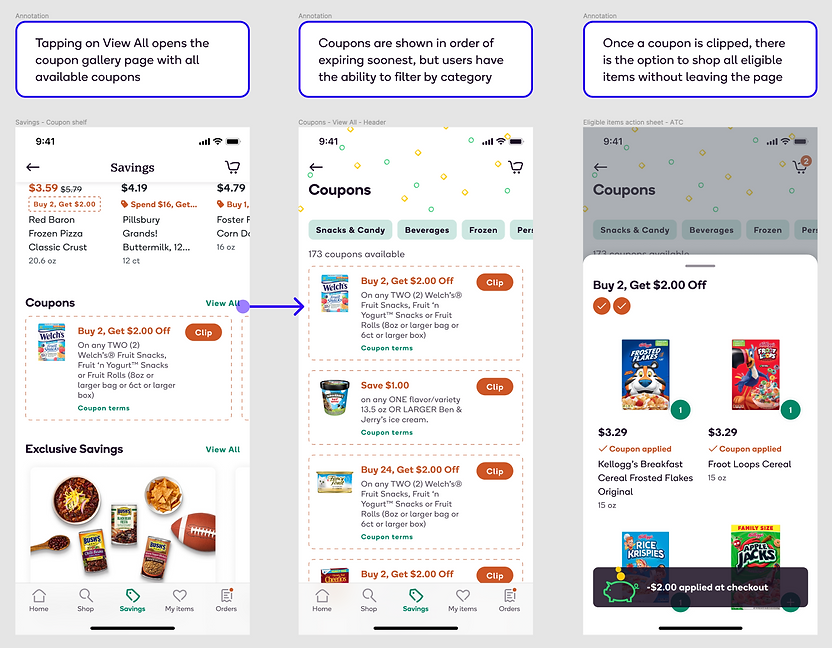
Dedicated coupon shelf and gallery page
Two quarters after launch, we saw a 58% redemption rate for coupons and a total of $1 million in savings passed on to our customers. Since v1 of coupons showed promise, we expanded coupon offerings with a dedicated coupon shelf and coupon gallery page. This accommodates for browse-now-decide-later behavior while still making it easy to add to cart directly within the coupon clipping flow.
Early Results on Lifetime Savings Stats
Overall positive results tracked two months after launch (July). Data analysis showed the more time or money a customer has saved, the more likely they are to reorder (the cohort with savings of over $100 had a reorder rate of 94%). The room for improvement is that the number of active members who viewed the modal was less than 1% (44k).
Fun fact: Of the people who viewed the modal, the average lifetime amount saved is $87 and the average total time saved is 20 hours.
Mock ups and annotations by Ashley Shen
Mock ups and annotations by Ashley Shen
At the time of writing this case study, there were no analysis or results available around the performance for special promotions yet.
Ideas for Future Improvements
Lifetime Savings Stats:
-
Make it clearer that chiclets are tappable or bring the context upfront so we don't have to rely on people tapping into the modal to find that information.
-
I saw multiple instances of people internally comparing with each other who saved more money and time. There is a fun competition element to it, and it makes me think there is a potential opportunity for introducing some kind of leaderboard element perhaps with a loyalty program concept.

Screenshot of our Zoom chat window
Marketing Promotions:
-
Make alcohol exclusion even clearer or more prominent. I suspect a lot of people try to hit the minimum required amount to get the discount by adding alcohol since those are relatively higher-priced items, but right now, you won't know that alcohol is excluded from promotions unless you tap into the terms link or until you're in the checkout process.
Cart Page:
-
Show total savings for the current order.
-
Possibly consolidate a Savings checkpoint that tells people how much they're saving, if there are deals not fully taken advantage of in their cart, ways they can bring their order total down, etc.