Making Muni Manageable
This was a mock project for the San Francisco Travel Association done in 2016. The first half of the case study shows the work we did as a group -- deliverables were research insights, wireframes, and usability test findings. The second half shows the work I did on my own to further develop it, which includes iterations based on usability test findings as well as the visual design.
Smell

Objective
SanFranciscoTravel wants a digital solution that will encourage visitors to see more of the city by relying on the Muni to get around.
There is so much to see in this 7x7 square mile, but most visitors only hit the famous attractions. The Muni covers over 70% of the city, but it’s underutilized by visitors. The more the city is explored, the better for the local economy.
The Problem
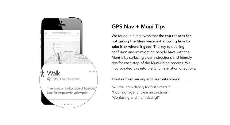
Visitors aren't utilizing Muni because it’s confusing, intimidating, and they aren't presented with centralized information about how to incorporate Muni into their trip.
From our user interviews and surveys, we found that people who have tried Muni generally had a bad onboarding experience. There weren't any! People didn’t know where the bus stops were, which side of the street they should be for the direction they want to go, how to pay, or what time the buses were coming.
There was also little reason or motivation to take the Muni to explore further than downtown and Fisherman's Wharf.
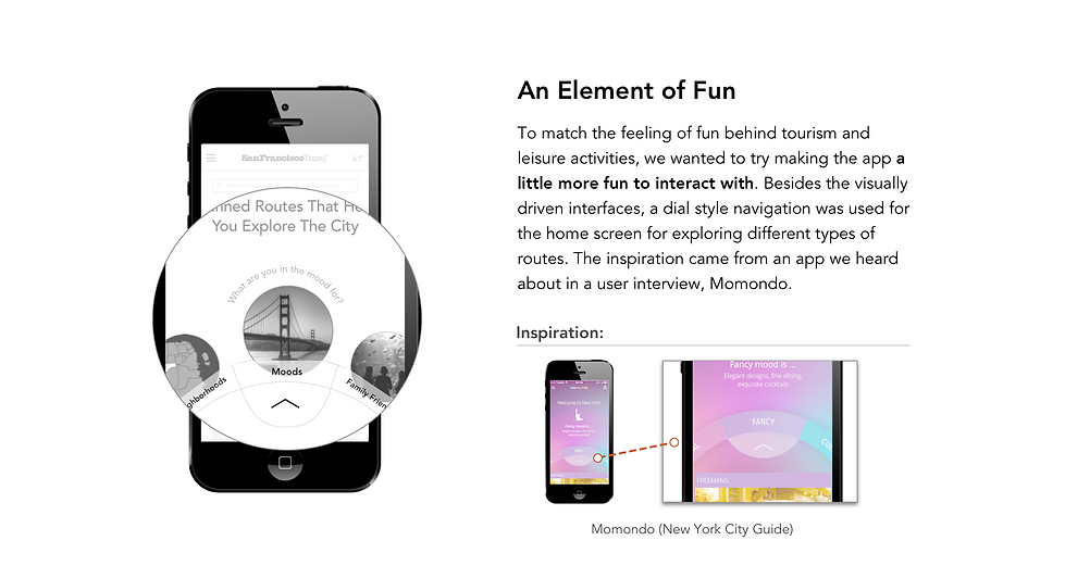
When we went out to Union Square and Ferry Building to interview tourists, we also found that most people had little knowledge of what to do in SF besides the usual tourist attractions so they didn't need a way to get around very far. Yet, people had the desire to explore more local hidden gems rather than sticking to the main tourist attractions, which inspired our concept.
Our Target
Our primary target would be the domestic visitor who is budget conscious and is open to using public transit.
International travelers were more likely to be taking the Muni already, due to sufficient information provided in their native language travel sites, guidebooks, or by hotel concierges. They do more research beforehand since they often won’t have cellular data.
Domestic visitors often drove a car, and regretted it due to parking and price. The problem is most of them weren’t aware of the public transit options in SF. They were open to taking public transportation had they known about it.
Design Decisions

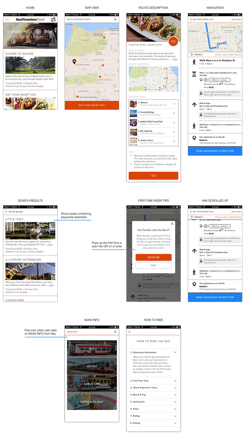
Annotated Wireframes
I led the UI design part of the project.
We sketched out the screens roughly and mapped out the flow as a team first. I then produced these in Sketch and added the annotations. The "Route Overview" screen and the "How To Ride" screens were done with Anna and Darren.

My Iterations
The following are my own designs to further develop the app.


In High Fidelity
Next Steps
-
Usability testing on the iterated UI
-
Look into incorporating audio option so that users don’t need to look at the app
-
Incorporate push notifications to show each navigation step when the phone screen is locked
-
Consider downloadable itineraries for international travelers (secondary user group)